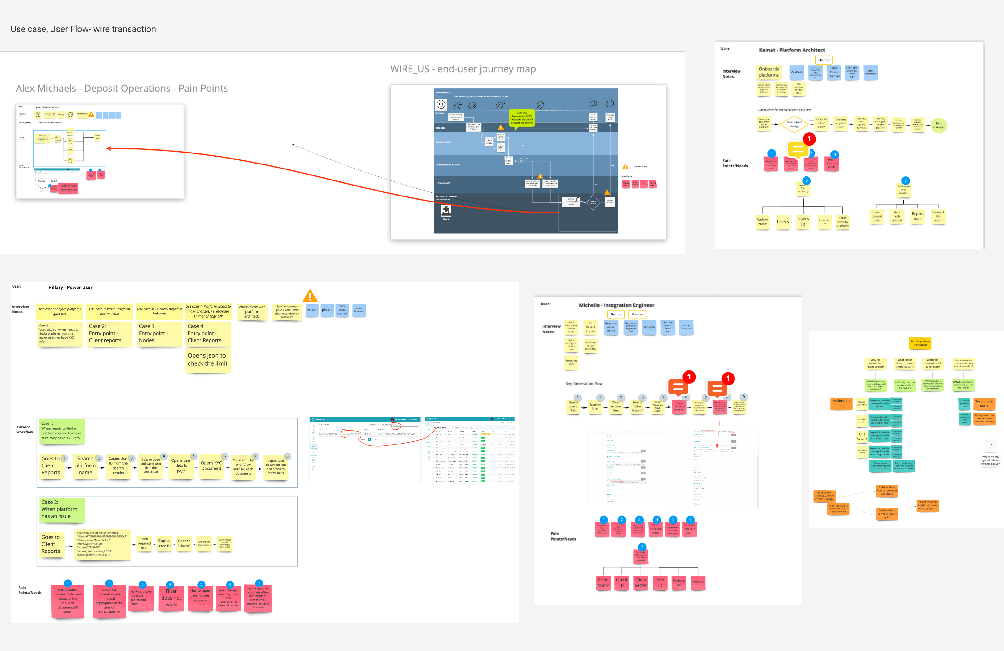
Client Dashboard- Before

Overall Problem
- Nearly all Participants thought the dev dash was difficult to use and navigate:
- It seems “confusing”, “unintuitive”, “not easy to follow” and generally not user friendly”
- Many noted that”important functions are not easy to find” upon logging in, meaning they are spending a lot of time trying to figure out how to use dashboard.
- It is difficult for infrequent user to know what functions they can and cannot do on the dashboard
- Some functions don’t work as advertised. (i.e. the never log me out button, batch transaction)
- Poor labeling and unclear language is pervasive throughout the entire dashboard.
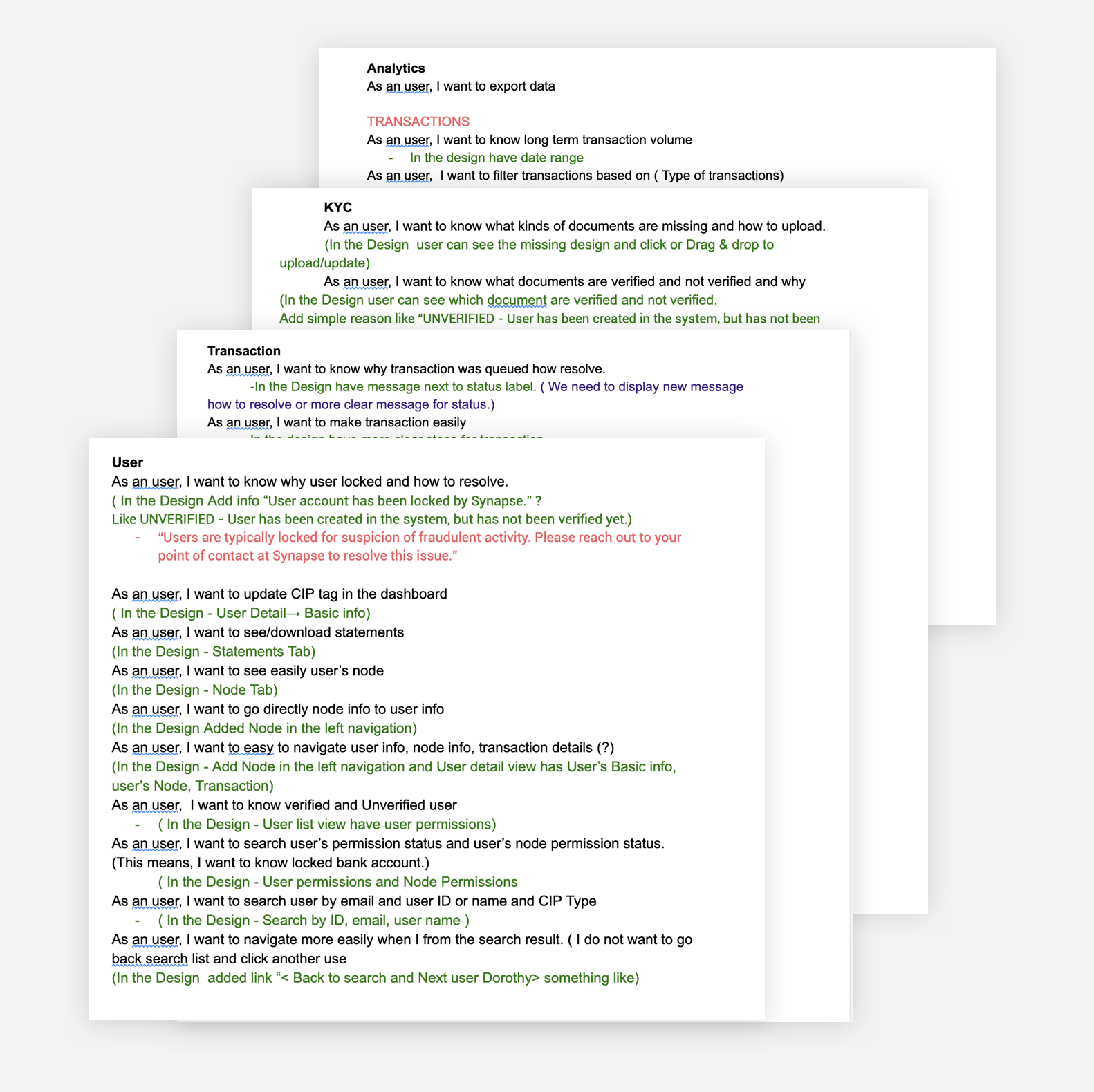
Dashboard_Reserch/User Story
Dashboard- After
Overall Goal:
- Give users more functionality and power to do things on their own
- Reduce the number of help tickets and slack messages we receive
- Make the experience more intuitive and easier to use
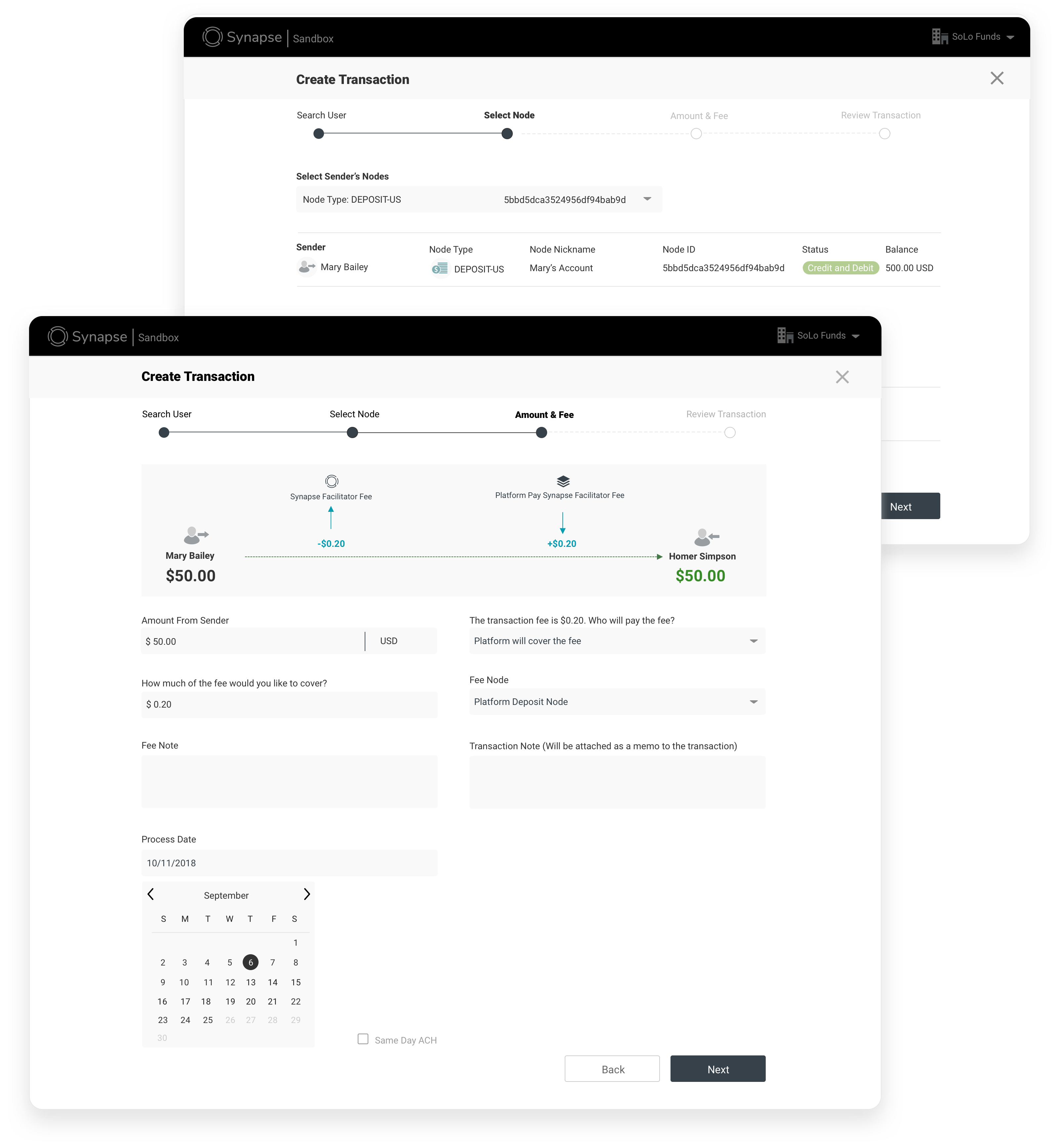
Create Transaction- Before
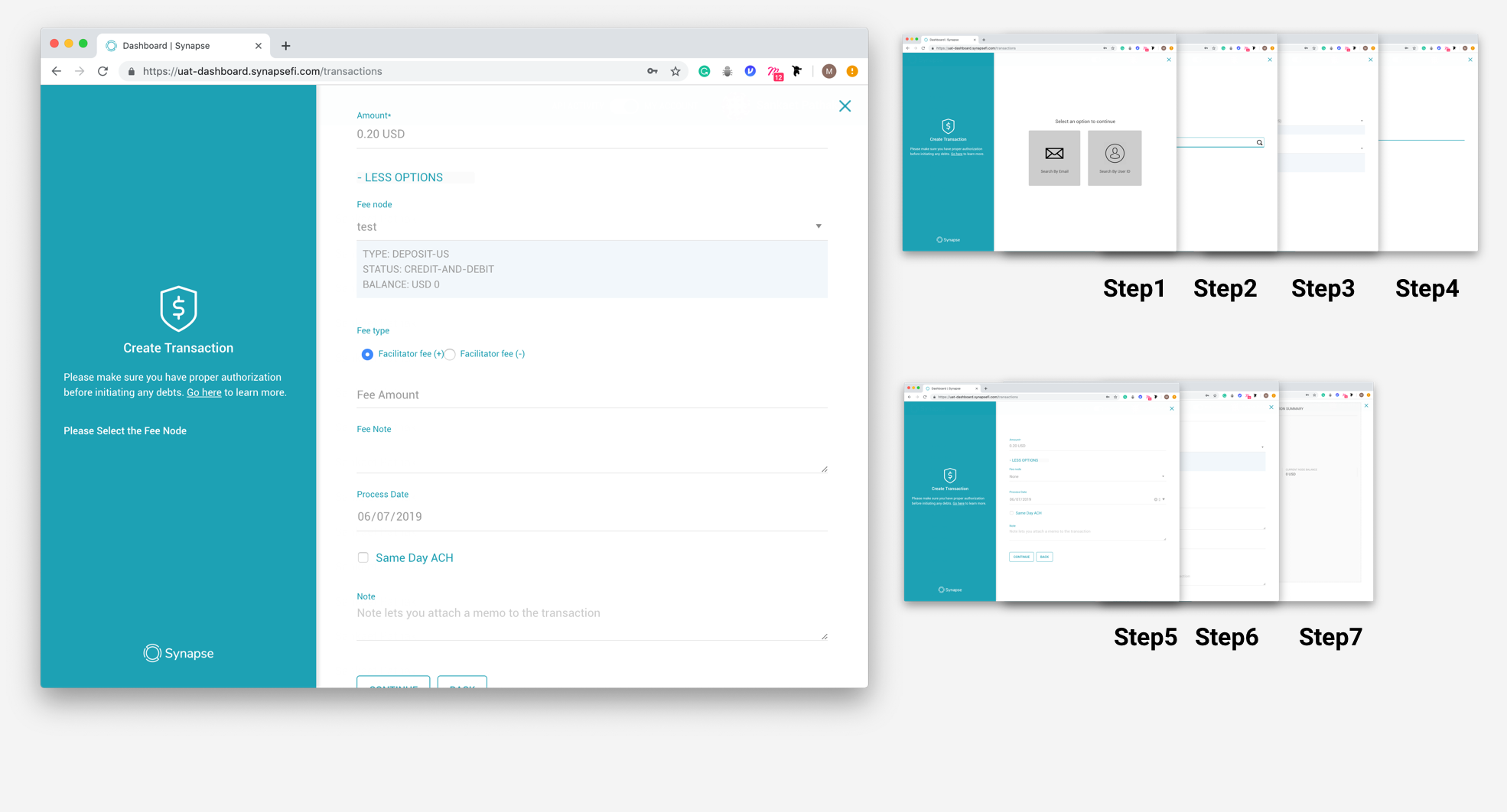
Pain point
- The flow is long and confusing
- Hard to know who covering the transaction fees
- Hard to know what the fee will be
Create Transaction- After
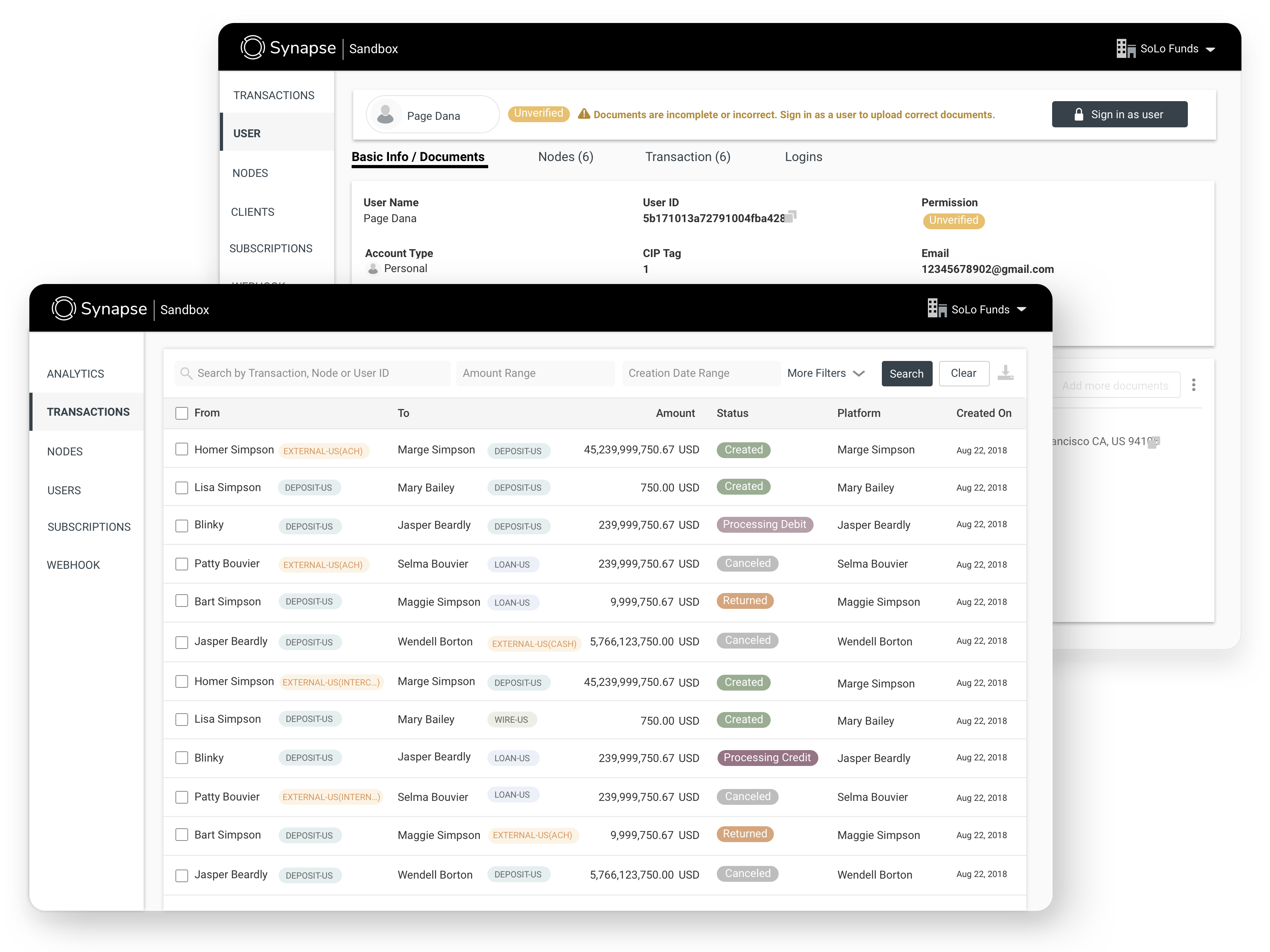
Dashboard: User detail- Before
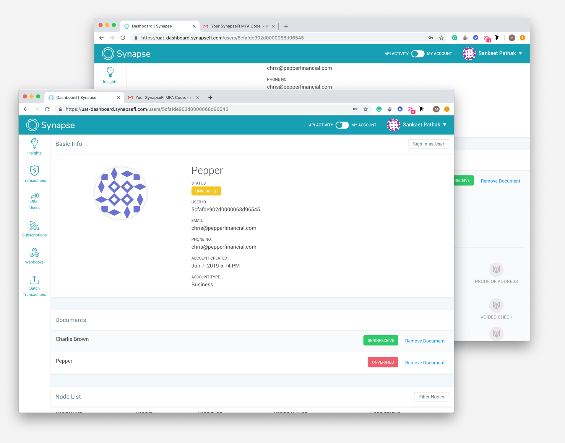
Pain point
- Hard to know user’s node until scroll all the way down.
- Hard to know what KYC is missing, and not how to take action and resolve the issue.
- Sometimes a document is verified but not necessary for the platform’s KYC requirements, so the green and red circles can be confusing.
- Hard to know what kinds of documents are not verified and why.
Dashboard: User detail- User information
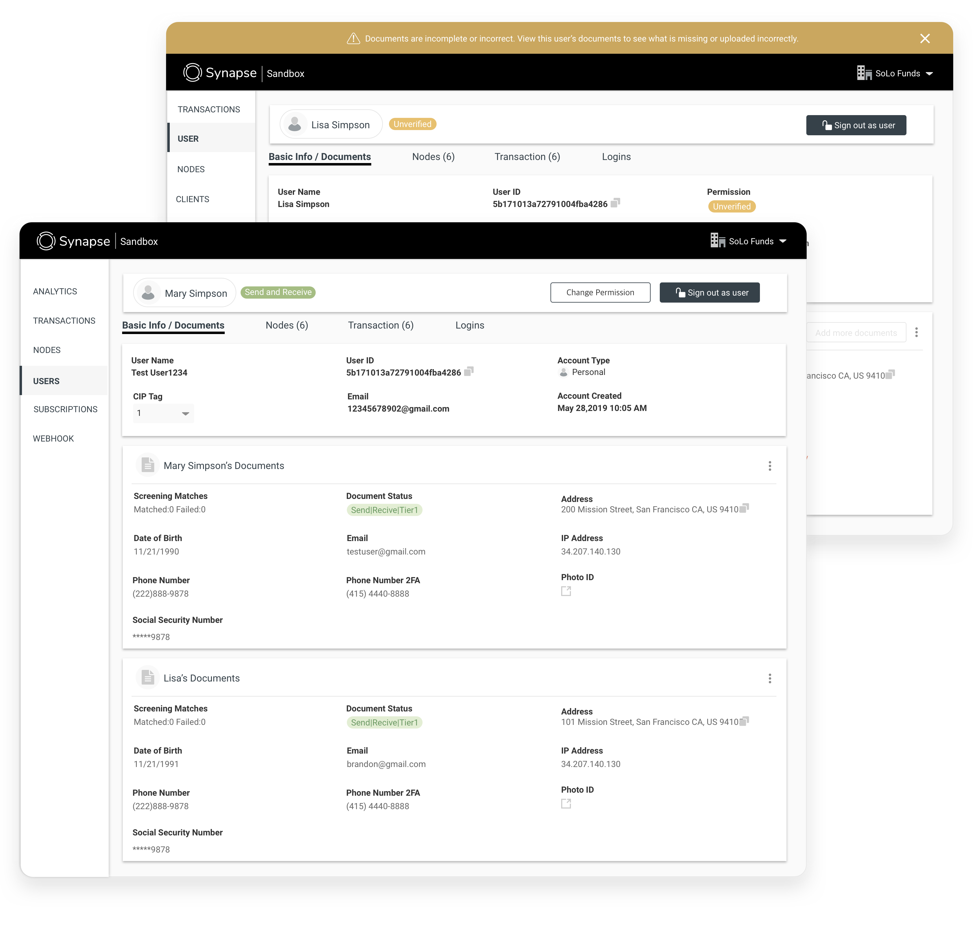
Dashboard: User detail- Transaction information

Analytics- Before

Pain point
- API request call times
- Balances on node
- Transaction volume ( especially long term instead of 30days)
- Verified/ Unverified users
- Want to be able to export data
Analytics- After

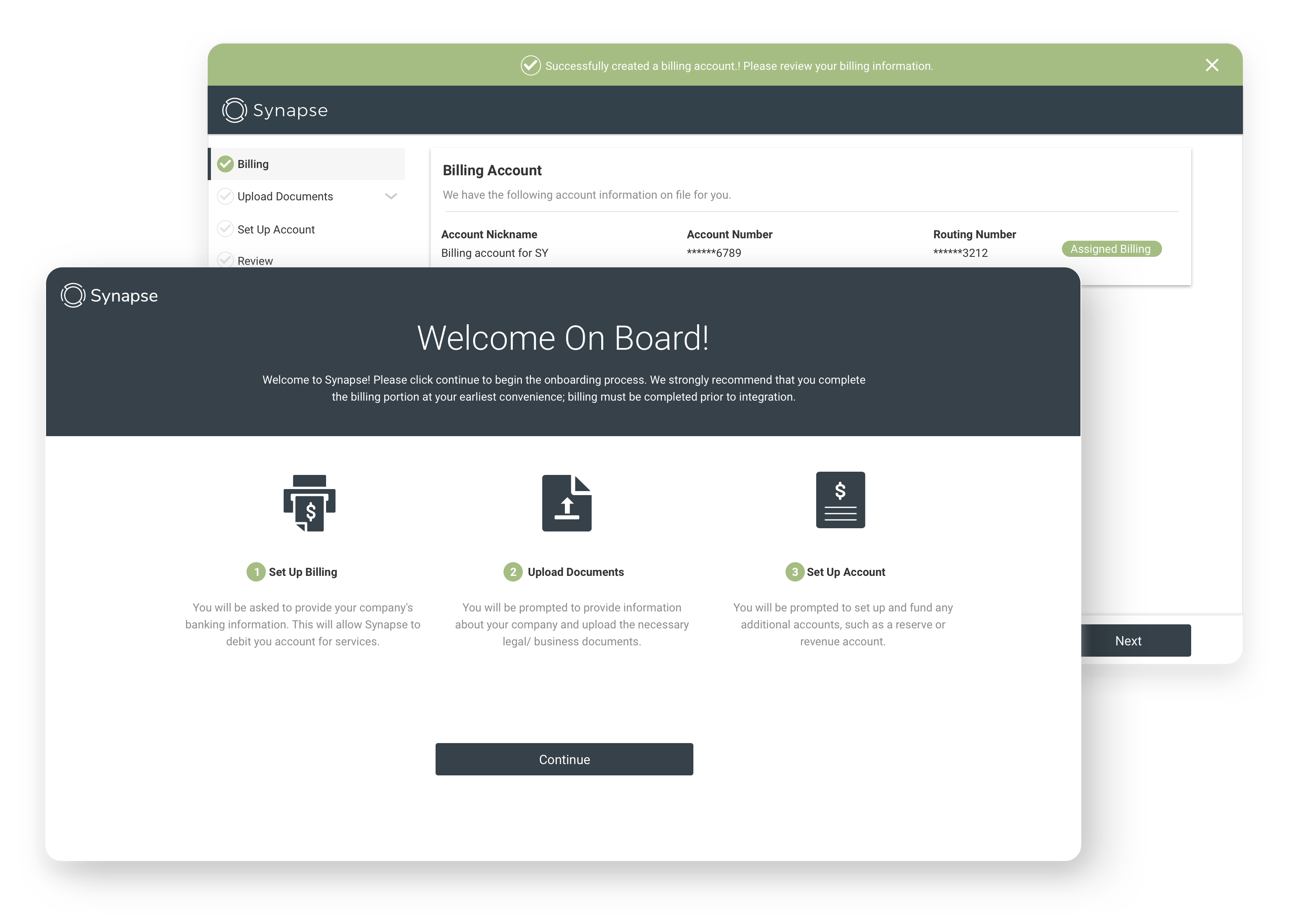
New Client Onboarding
Pain Point:
- Too much of phone call PA+ Client
- Cannot delete, add or edit documents
- Hard to know what is next
New Client Onboarding
Overall Goal:
- Give users more functionality and power to do things on their own
- Reduce the number of help tickets and slack messages we receive
- Make the experience more intuitive and easy to use
SynapseFI Style guide

Tiger Oil’s Corporate Identity

The tiger Oil is an oil company that is one of the branch companies of Hyundai Oil. Tiger Oil needed strong visual impact compare with other oil companies. I made a visual strategy to use their company name and mark, and I decided to use a tiger for the company’s trade mark.


Shinsegae Department Store’s Corporate identity
This expressed freedom and variety through seven petals and produced an image that gives the feeling of nature and happiness in this multimedia age.


Kim Sat Gat Brand Identity
This expressed freedom and variety through seven petals and produced an image that gives the feeling of nature and happiness in this multimedia age.


011 Leaders Club Brand Identity
This expressed freedom and variety through seven petals and produced an image that gives the feeling of nature and happiness in this multimedia age.


Logo (Taxi-On & Vanza Korea)
Vanza Korea is a company for providing business center services to foreign companies in their early stages of operation in Korea. Also, they provide total career consulting services including job search and outplacement. The corporate identity show their credibility to foreign companies. I used dark red for classic feeling and I used black for modern feeling.

